
Hold on…
Aligning pixels for a perfect view
How we increased more downloads & subscription by improving User Experience


Year
2021
Collaborator
Sanjith & Gabreilla
Platform
Android, IOS, WebAPP
My Role
I Co-led the research & design of HolaDoc, a seamless platform enabling patients to connect with doctors in real time, revolutionizing access to healthcare.
Context
Sinapsis is virtual Spanish health care app based in Venezuela which helps to connect patients and doctor virtually. Initially, Sinapsis has been designed for very small user base that lead to lot of UX problems.
Business Goals
Scale for 10x users, Improving retention, increase in downloads & subscriptions
Problem
Post installation of the application significant amount of dropouts
Solution
We introduced upfront pricing transparency, streamlined onboarding for quicker access, and redesigned navigation for intuitive doctor connections. Additionally, we enabled multiple communication modes (chat, audio, video) and integrated an in-app prescription tracker for seamless follow-ups.
How did we empathise the users?
Through surveys with 52 users, in-depth usability testing with 5 participants, and data insights provided by the tech team, we uncovered key challenges shaping the user experience - direct insights driving impactful solutions
01
Absence of Clear Value Proposition
Users couldn’t immediately grasp the app’s benefits, leading to low engagement and a lack of perceived value.
Metric: 45% of users did not complete onboarding or explore app features further.
02
Lack of Transparent Pricing Information
Users felt uncertain and hesitant due to the absence of pricing details before onboarding. This lack of transparency led to a drop-off in engagement during the initial app experience.
Metric: 35% of users abandoned the app during onboarding due to pricing concerns.
03
Lengthy and Complicated Onboarding Process
The onboarding process was overly time-consuming and cumbersome, causing user frustration and drop-offs.
Metric: Average onboarding time was 2 minutes, with 40% of users abandoning before completion.
04
Inefficient Prescription Tracking
Prescriptions sent via email were difficult for users to track, leading to frustration and a poor post-consultation experience.
Metric: 50% of users reported losing track of emailed prescriptions, resulting in repeated consultations.
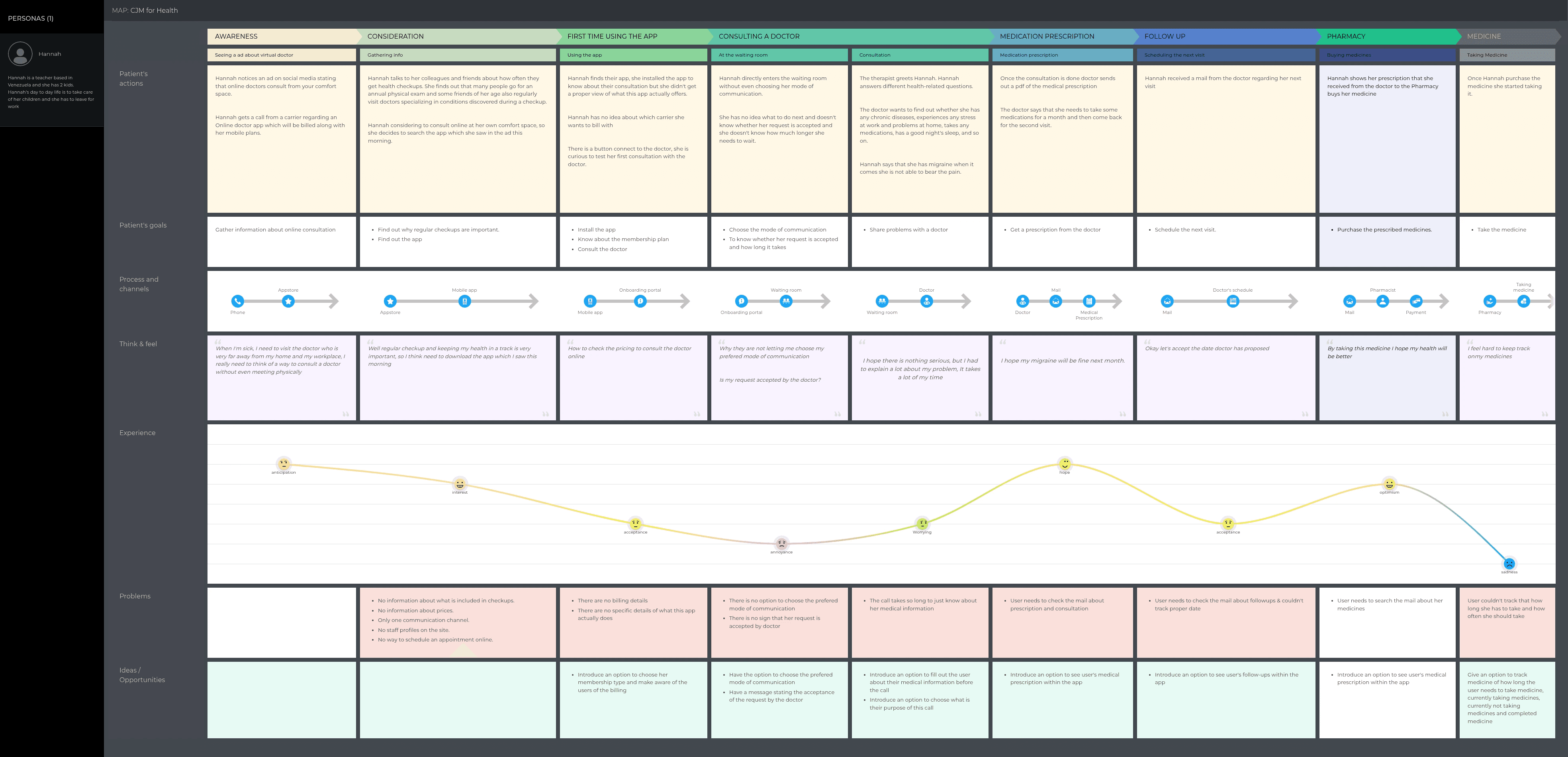
Journey Map
Using insights from our research, we created a journey map that captured user actions, mindsets, and emotions-shedding light on key pain points and opportunities for improvement
How we made the UX journey smoooooth
We collaborated closely with our tech team, brainstorming and building solution flows to address these challenges. Together, we ensured the solutions were both user-centric and technically feasible.
User Flow
Once we had an understanding on the hierarchy, we started with user flow from start to end experience with every possible scenarios.

User Testing= Fail Early
We tested our solution in greater detail, including high-fidelity designs, as many users needed more specifics to provide meaningful input. We assigned two tasks to the users

Final Design
Our final design is a refined, user-driven solution shaped by research, testing, and feedback. It ensures clarity, accessibility, and seamless interactions, balancing business goals with user needs for an intuitive experience.

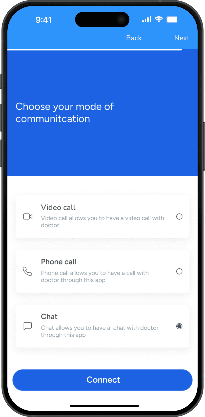
Screen post splash screen
First impressions matter—highlighting value upfront taps into availability bias, making the app’s benefits memorable and impactful.

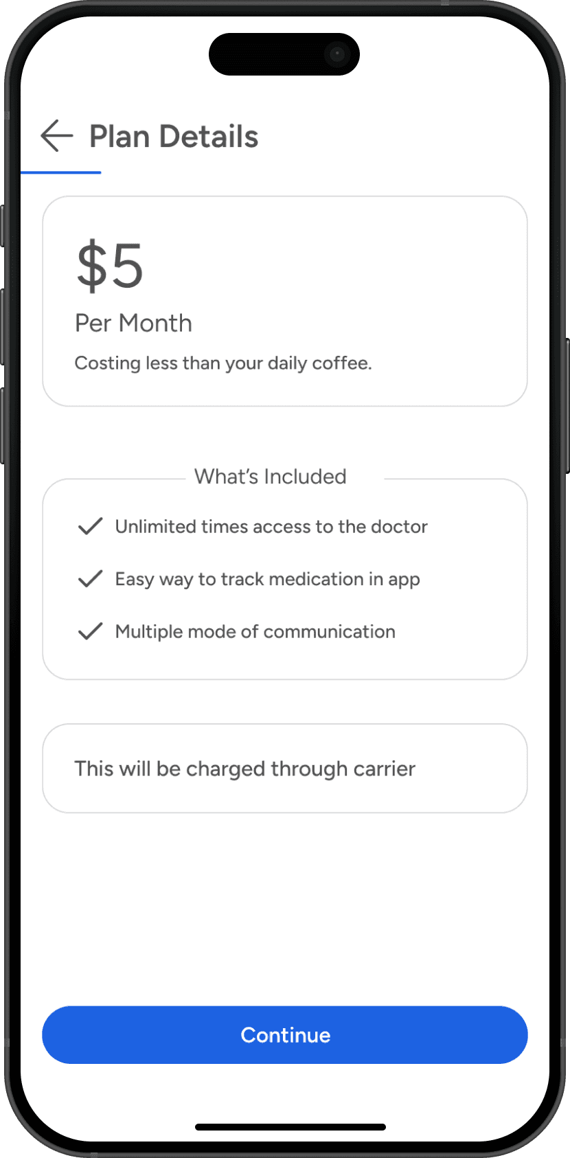
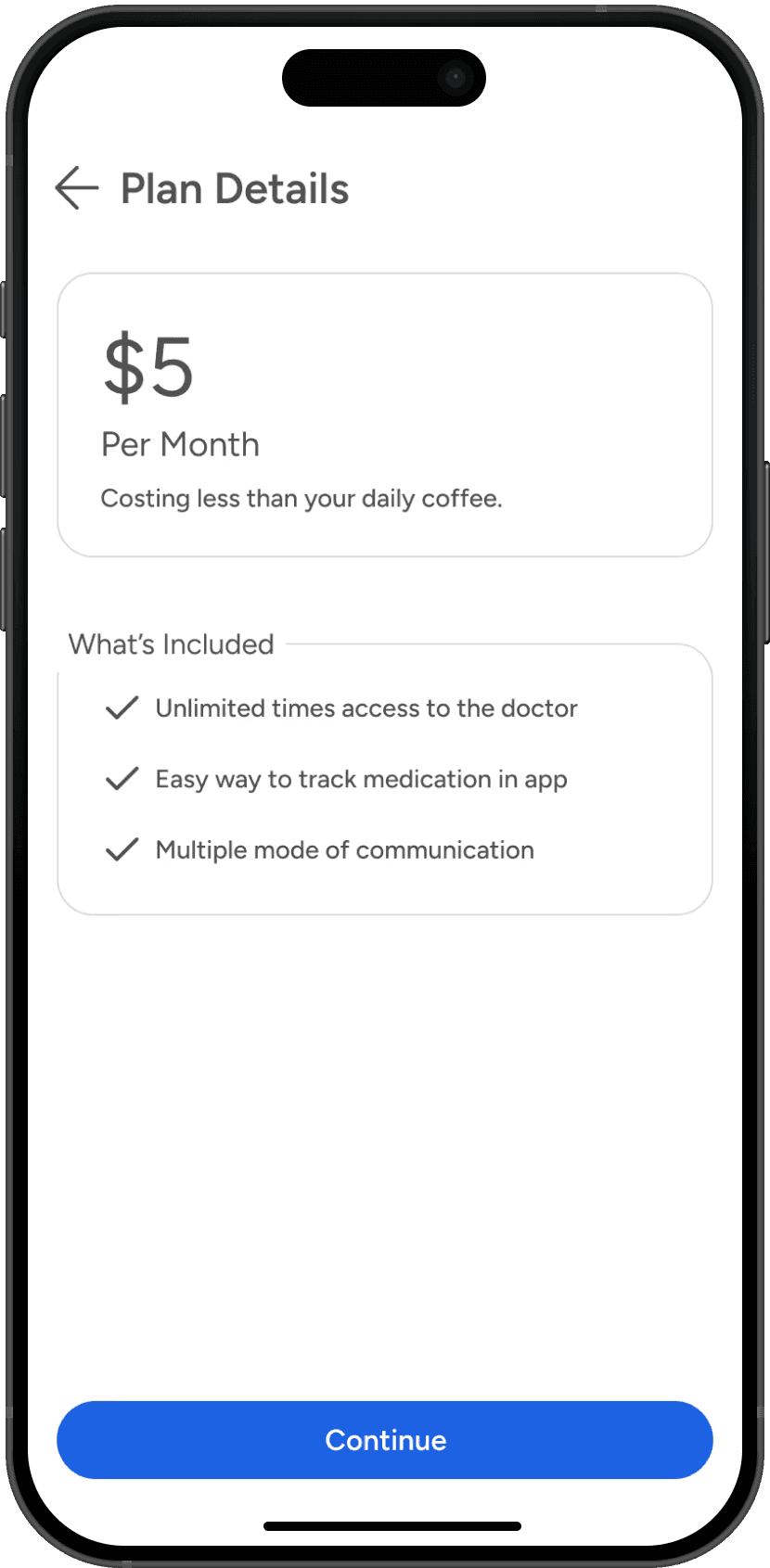
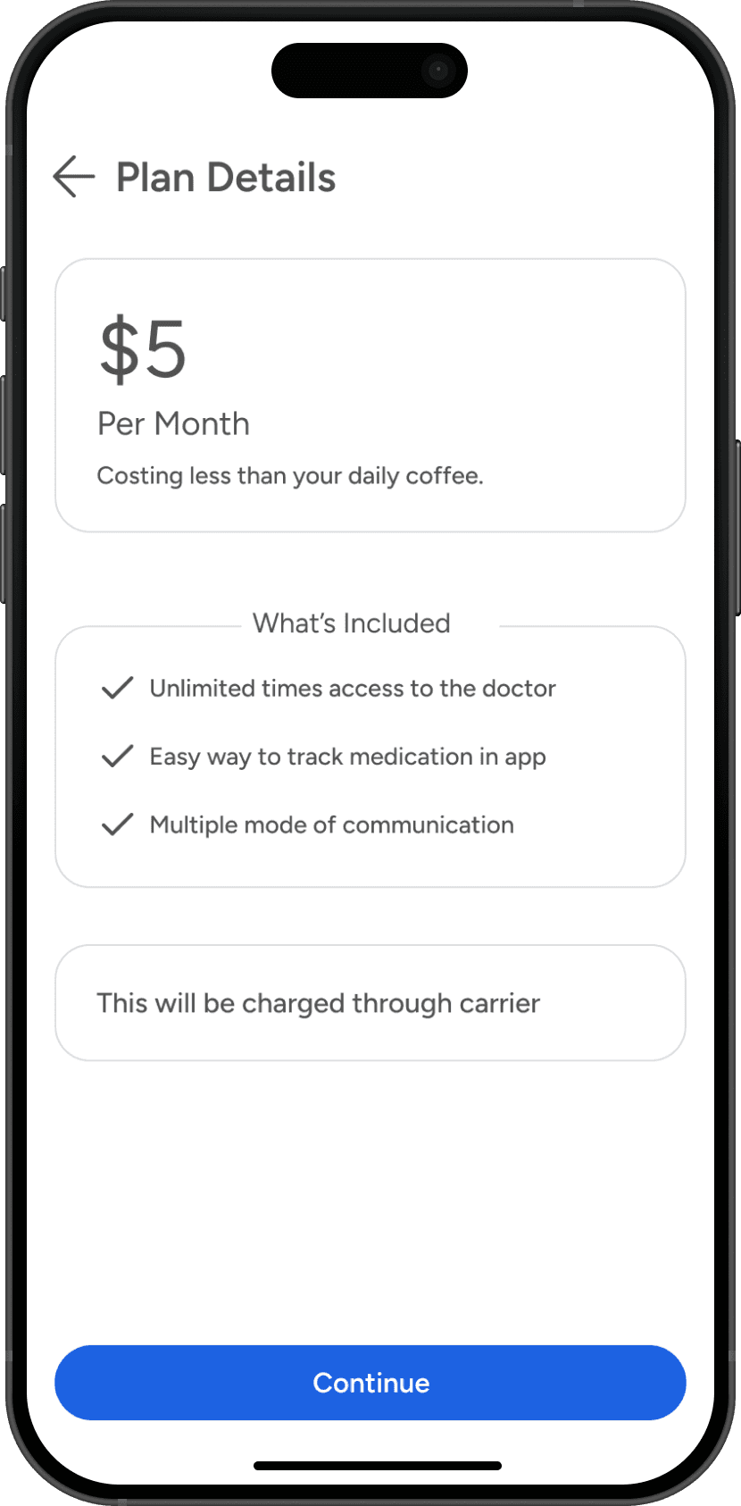
Pricing
Transparency builds trust—users want to know what they are committing to before proceeding.
Accessbility
The design meets AA accessibility contrast standards
WGCAG AA passed
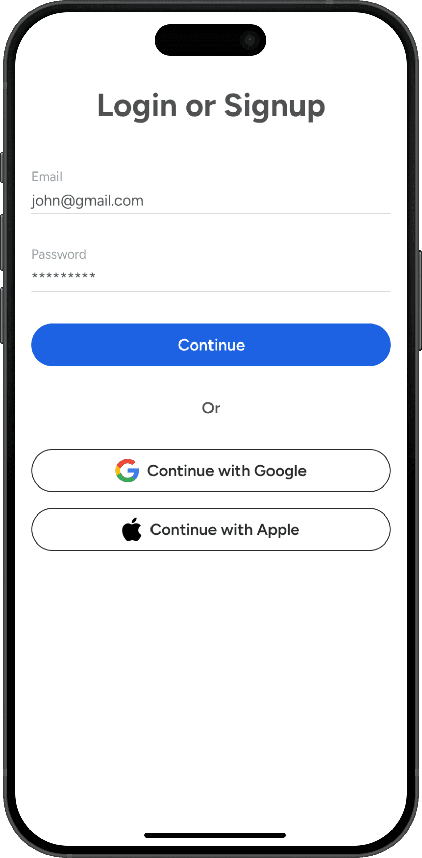
Onboarding
Streamlined onboarding reduces friction costs and increases user retention by creating a positive first impression.
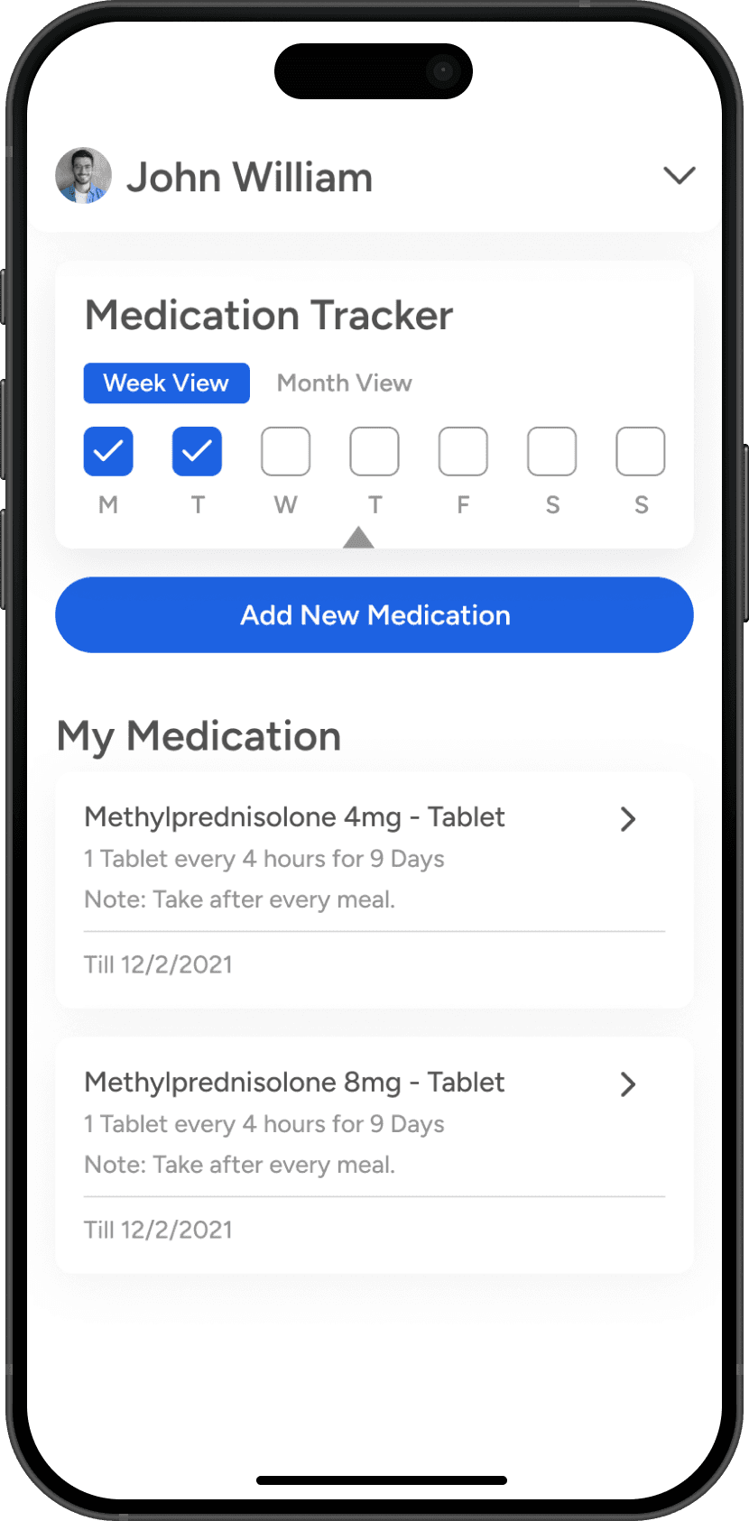
Prescription Tracking
Simplifying access to critical information reduces cognitive load and enhances user trust.
Reduced Onboarding Time
Time to onboard reduced from 2 mins to 40 seconds
Improved Navigation
95% user can schedule a connect with doctors effortlessly
Data-Driven Decisions Improve Outcomes – Insights from user surveys, usability testing, and tech team data helped shape solutions that directly addressed real user pain points.
Collaboration Drives Better Solutions – Close coordination between design, tech, and business teams ensured that solutions were both user-friendly and technically feasible.
Agile Approach Improves Iteration – Rapid testing and iterative design allowed us to quickly validate assumptions, pivot when necessary, and optimize solutions in real-time.
Cross-Functional Alignment is Key – Engaging stakeholders early and frequently helped streamline decision-making, reducing misalignment and rework.